I’m putting some serious thought into a long-needed upgrade to my rather lamentably home-made website, www.elenagreene.com and I’d love to have some input from readers.
Of course it is important to have a website that is uncluttered and easy to navigate. Although I personally don’t care to surf the web on my phone, but I know a lot of people do, so it’s also looking important to have a site that is mobile-friendly.
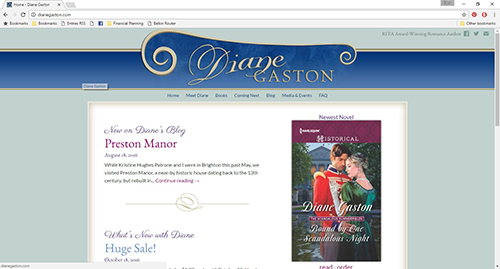
As for style, I’ve been looking through a lot of historical romance authors’ websites to get ideas of what might work for mine. One of my favorites is our own Risky Diane’s website at www.dianegaston.com. Here’s a screenshot. I think it’s elegant and has a romantic, historical feel without being too busy or flowery.
Some other website along these lines include: www.lorettachase.com and www.janmarieanello.com.
I also do happen to enjoy sites that have more imagery, including romantic couples and stately homes. Some examples: www.sarahmaclean.net and www.cynthiawrightauthor.com.
I’ve also noticed that some sites combine simple, elegant graphics with an author portrait. Examples: www.eloisajames.com and www.tessadare.com. I’d probably want to get a new headshot for this type of site, although that might be a good idea anyway.
So I’d love to hear what you think.
How often do you visit author websites?
- Occasionally (a few times a year) (50%, 7 Votes)
- Often (at least once a month) (36%, 5 Votes)
- Rarely (14%, 2 Votes)
- Never (0%, 0 Votes)
Total Voters: 14
Where do you most often view author websites?
- laptop or desktop computer (62%, 8 Votes)
- tablet (31%, 4 Votes)
- a mix (8%, 1 Votes)
- mobile phone (0%, 0 Votes)
- I don't visit author websites. (0%, 0 Votes)
Total Voters: 13
What style of historical romance website do you most enjoy?
- I don't care as long as I can find what I want (46%, 6 Votes)
- Simple, elegant graphics (38%, 5 Votes)
- Romantic images of people and scenery (8%, 1 Votes)
- Other (please explain in comments) (8%, 1 Votes)
Total Voters: 13
How do you feel about having the author's portrait on the main page?
- I don't care one way or another. (46%, 6 Votes)
- I like seeing the author's portrait on the main page. (38%, 5 Votes)
- It's OK to just have the author portrait on the bio page. (15%, 2 Votes)
- I'd rather not see the author portrait. (0%, 0 Votes)
Total Voters: 13
Please feel free to comment on any of your answers and let me know if there’s anything else you think is important.
Thanks!
Elena


I voted (where do I get a sticker?) because obviously, I’m not just an author; I’m also a reader. At the moment, I really like minimalist, uncluttered website with just a few flowery frills. I love the design and color scheme of Eloisa James’ website, but for my taste, the pages are a bit too cluttered. There is too much going on on nearly every page.
I love how Diane has organized her website – it’s very neat and ordered, but with a sprinkle of frills.
I used to have my author picture on my homepage, but when I revamped my site, I decided to move it to the bio page and instead use the landing page to highlight the sign-up link to my newsletter / the Starter Library as well as my latest release.
Actually, I took a page out of Carolyn’s book when I came up with the design for my page: I really love how she uses boxes on her website to help the visitor tell different kinds of info apart. 🙂
Thanks for the suggestions. And I just checked out your site–I don’t think I have visited in a while–and I like it a lot.
I definitely agree that Diane’s site design is elegant. The portrayal of her writing and personality matches the elegance of her site, so it works. Sarah MacLean’s site is sexy and has a touch of mystery which is an undertoned theme in many of her series so that works well too. I think everyone knows Eloise James and her Shakespearean Profession so having her picture on the site is very easy to see.
I think you should just go with what you believe will portray your writing style and how your books fit. And of course add in some touches of your own personality too and a catching brand. Good luck.
Thanks, Ki Pha! I am trying to figure out branding. The more I think about it, the more I like the idea of a simpler design but having the my love for romantic historical imagery come through with book covers and other images posted, like background information on stately homes and locations that inspire my work.