Back to Top

Category: Risky Regencies

Moving has kept me from a lot of things I enjoy–like hanging out at the Risky Regencies. This move has been more problematic than most, and I’m still dealing with items that were damaged by the Movers from Hell and other matters.

The new house has plenty of room for me, my college student daughters, and our stuff–even our books! But it lacks proper storage–especially for our books! This picture is of my future writing room. My writing desk didn’t make it around the bend in the stairwell, so I have bought a new one and will pick it up once things are more settled. Although is not quite Regency era (I am guessing early 1900’s) it makes me think of what a Regency lady might have used. I will post a picture once I get it home. One of my largest bookcases didn’t make it up the stairs (sob!) so I am planning to buy some modular shelving that can be built inside the room. For now, everything has to stay in boxes, and my writing remains on hold until I get other, more critical areas of the house functional, like the kitchen (although I did find the coffee maker).

Anyone have stories to tell of past moves. Advice for coping until I can find things?

Thanks for your patience, everyone. I will be back soon, I hope!

Elena

She was busily searching through the neighbourhood for a proper situation for her daughter, and, without knowing or considering what their income might be, rejected many as deficient in size and importance.

“Haye Park might do,” said she, “if the Gouldings would quit it — or the great house at Stoke, if the drawing-room were larger; but Ashworth is too far off! I could not bear to have her ten miles from me; and as for Purvis Lodge, the attics are dreadful.”

For the past few months, I’ve been busy selling my current house and looking for a new home, and like Mrs. Bennet in the quote above from Pride and Prejudice, I have been thinking about locations and room sizes. If I were as unrealistic about my means, I might also be dreaming of a stately home in England. Googling around, I found this list of stately homes for sale at the Telegraph: “Buy Your Own Downton Abbey” (I couldn’t find a date for this, but if you’re in the market for a stately home, I guess you could inquire!)

I rather like Mynde Park Estate, in Herefordshire, parts of which date from the 11th to the 18th century. Can’t you just picture coming up this drive in an elegant carriage?

By Roger Cornfoot, CC BY-SA 2.0, https://commons.wikimedia.org/w/index.php?curid=67645180

Langham Hall, in Norfolk, is also very pretty. And it has an orangery!

By Bob Jones, CC BY-SA 2.0, https://commons.wikimedia.org/w/index.php?curid=14339309

Since I am not, in fact, as unrealistic as Mrs. Bennet, I managed to find a nice house within my budget. Although the wheels are still turning on both house sales, it looks like this will be my new home. Although it does not boast an orangery, it does have a cute porch!

Have you had any interesting experiences house hunting?  What would be your fantasy home?

Elena, hoping to get back to writing soon!

Lately, I’ve been busy reworking some furniture to suit the new life I’m creating for myself. Although I’m more sure about my taste than I used to be, I’m still drawn to design that evokes something of a Regency or neoclassical feel.

A while back, I bought a set of dining chairs that are early 20th century reproductions of earlier styles. Here’s one of them, followed by the image of an English chair c.1780.

My newer projects include restoring some vintage items that I got inexpensively due to condition issues. Again, the lines remind me of late Georgian design. Here’s a dresser I got which I believe is in the style of Duncan Phyfe, an American designer in the Federal (neoclassical) style, who was inspired by English designer Thomas Sheraton.  For comparison, it’s followed by a Duncan Phyfe sideboard.

Although most of the dresser is in good shape, the top was quite damaged. Here, just for bragging purposes, are three of the stages of the restoration. I still have to do the final finish, but I’m happy with the progress!

I’ve also been remaking some furniture I already had, including this armoire. The nice people at the Purple Painted Lady helped me with materials and instructions. I had to custom mix the paint, and it was only after I was finished that I realized that it was Wedgewood blue, reminiscent of Jasperware created by Josiah Wedgewood.

Here’s a late 18th century jasperware scent bottle so you can see how close I got, without knowing that I was trying! In person, the color contrast of the blue and white is a bit stark, but I have to give it a dark wax glaze which should soften the contrast and bring out some of the details.

Anyone else find themselves decorating with elements of earlier styles? Anyone else try  refinishing or painting furniture, and how did it go?

Elena

The Fairy Ring title page
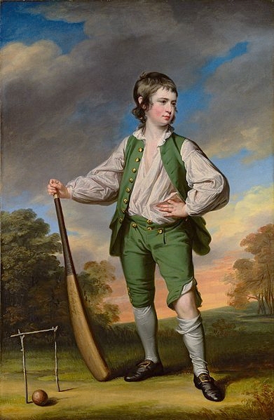
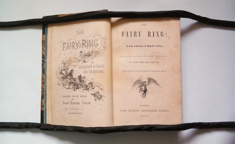
My new book Yuletide Truce, which comes out next week, starts with dueling reviews of a collection of fairy tales: The Fairy Ring, published on 9 December 1845 (though the title page gives the year of publication as 1846), in time for the Christmas season. It contains fairy tales from the collection of the Brothers Grimm, translated by John Edward Taylor.

John Edward Taylor was the cousin of Edgar Tylor, the man who in 1823 had produced the very first English translation of a selection of the Grimms’ fairy tales. He published them as German Popular Stories, with a second volume following three years later.

While Germany had seen a renewed interest in fairy tales since the late 18th century, it were the Taylors’ translations of the Grimms’ stories and, later on, Mary Howitt’s translation of Hans Christian Andersen’s fairy tales that led to a similar fashion in Britain, where it would eventually produce a new genre, fantasy fiction, in the second half of the 19th century.

The publication history of the Grimms’ fairy tales at home and abroad is in many ways a peculiar one. When the first edition of the Kinder- und Hausmärchen was published in 1812/15, it bore evidence of the conflicting aims the Grimms pursued. One the one hand, the collection was meant to be a scholarly project documenting a specific form of German “folk literature,” hence the extensive notes that accompanied the collection. There, the Grimms tried to establish the history of individual tales as well as document connections to the folk literature of other nations. On the other hand, the Grimms built up a fictional version of how they had obtained the tales to establish them more firmly as authentic folk tales. Which is why even today, there’s the persistent myth that Grimms marched from village to village, knocking on people’s doors and asking to be fairy tales, when they received the majority of their tales from acquaintances, in particular middle-class women.

The first edition of the Kinder- und Hausmärchen received mixed reviews, and many felt that, despite the “children” in the title, the tales weren’t really suitable for a young audience, not the least because many of them contained very clear sexual allusions. In subsequent editions, the existing tales were edited (mainly by Wilhelm) to bring them more in line with patriarchal, middle-class values and more tales were added to the collection.

Thus, the text of the Kinder- und Hausmärchen was constantly in flux, and as a consequence there is little conformity among the English translations of the collection. For not only was their selected material taken from different editions of the original collection, but the translators themselves also tended to heavily edit the tales. This is already evident in the very first translation from 1823: Edgar Taylor left out references to the devil and shied away from sexual allusions, which is why his version of “The Frog King” is heavily altered.

But the most important change to the German source material was the inclusion of illustrations by George Cruikshank. This new feature proved to be so successful that it inspired the Grimms to let their brother Ludwig Emil Grimm illustrate their own Kleine Ausgabe of 1825.

Like Edgar Taylor’s German Popular Stories, his cousin’s translation The Fairy Ring was also illustrated — and by one of the most popular artists of the 1840s: Richard Doyle.

The Fairy Ring: illustration for "The Two Brothers" with floppy-eared dragon
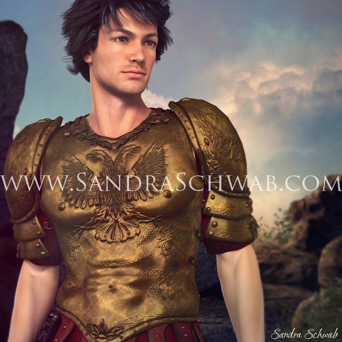
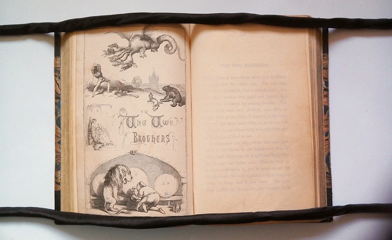
Christoper Foreman, one of my characters in Yuletide Truce, takes issue both with John Edward Taylor’s text and Doyle’s illustrations, which allowed me to write a snarky Victorian style book review. 🙂

This is what Kit Foreman has to say about the illustrations:

“The illustrations of The Fairy Ring were done by Richard Doyle, whose illustrations in Punch regularly delight that magazine’s readership. It is, however, debatable whether his whimsical style is quite suitable to adequately depict fearsome dragons, malicious dwarves, and giants, no matter into what raptures of praise the pictures have thrown our colleague at Munro’s. Are we really to believe in the fearsomeness of a dragon whose heads resemble those of sad puppy dogs?”

Oh dear! Poor Dicky Doyle! (And poor Aigee, whose review Kit trashes so mercilessly!)

If you’d like to get a longer sneak peek at Yuletide Truce (and Kit’s review!), check out the excerpt on my website!
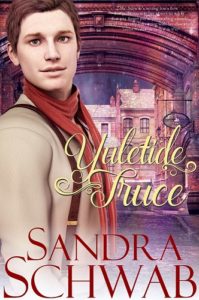
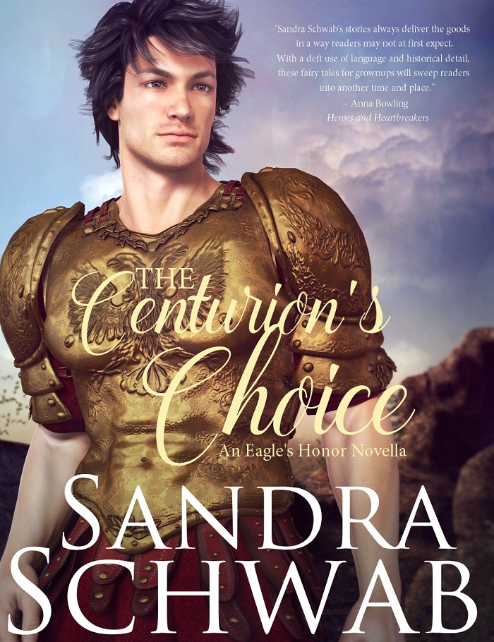

cover Yuletide Truce

Yuletide Truce

London, 1845

It’s December, Alan “Aigee” Garmond’s favorite time of the year, when the window display of the small bookshop where he works fills up with crimson Christmas books and sprays of holly. Everything could be perfect — if it weren’t for handsome Christopher Foreman, the brilliant writer for the fashionable magazine About Town, who has taken an inexplicable and public dislike to Aigee’s book reviews.

But why would a man such as Foreman choose to target reviews published in a small bookshop’s magazine? Aigee is determined to find out. And not, he tells himself, just because he finds Foreman so intriguing.

Aigee’s quest leads him from smoke-filled ale-houses into the dark, dingy alleys of one of London’s most notorious rookeries. And then, finally, to Foreman. Will Aigee be able to wrangle a Yuletide truce from his nemesis?

WARNING: Contains a very grumpy writer, snarky Victorian book reviews, a scandalous song, two men snogging, and fan-girling over Punch.

Now available for pre-order: Amazon US | Nook | ibooks | Kobo

These past few weeks I’ve been thinking a lot about portraits in painting and the art of portraiture. This is perhaps hardly surprising as I needed to think about a cover for my new Roman story and also started a hashtag project on Twitter and Facebook (#FreePortraitFriday), where authors can share a description of their main characters and I’m going to pick one to do a free character portrait.

Those are excellent exercises for me as I don’t just have to think about how to visualize the verbal physical descriptions of a character, but also how to visualize the…eh…character of said character. Like, is that person shy or self-confident? Kind? Arrogant? Mischievous? Those character traits will translate into the pose and expression and are nearly as important as the physical characteristics.

A couple of years ago, there was an exhibition of children’s portraits at the Städel, a famous art museum in Frankfurt, and while I didn’t manage to go and see it, I did manage to snatch up a catalogue of the exhibition. The catalogue doesn’t just provide the reader with a good overview of the history and development of children’s portraits, but also invites the reader to look more closely at the small details. When you look at Joshua Reynold’s portrait of little Frances Crewe from 1775 (“Miss Crewe“), when more realistic portraits of children that emphasized their individual personalities rather than family and heritage, had just become all the rage, you can easily see what a sweet, funny little girl Frances must have been.

Francis Cotes, "The Young Cricketer"

Francis Cotes, “The Young Cricketer” (from Wikipedia)

For his portrait of young Lewis Cage, the artist Francis Cotes chose a pose reminiscent of that of military heroes, hinting at the boy’s self-confidence. However, he immediately subverts this pose and we are reminded that this is a little boy, for in contrast to the men depicted in those military portraits, young Lewis looks far from neat and tidy: his waistcoat is unbuttoned, a corner of his shirt is hanging out of his breeches, which have become unbuttoned at his left knee. All those details add to the vitality of the portrait by hinting at the vitality and physicality of the child: he is dirty, sweaty, and stinky, but immensely proud of his achievements in cricketing.

And all those paintings of little children cuddling with their pets with obvious affection? How cute are those? Joshua Reynolds’ little “Miss Jane Bowles” (1775) exuberantly hugs her (long-suffering?) pet spaniel while smiling mischievously. And when Henry Raeburn painted his step-grandson in 1814 (“Boy and Rabbit“), he depicted little Henry as an affectionate young boy who tenderly cradles his white pet rabbit in his arm.

Posing is something I find rather difficult when I’m working with my digital models (and not the least because digital models don’t automatically pose naturally and, thus, if you don’t do it correctly you end up with a wooden-looking zombie — NOT the kind of look you really want to go for) (unless you’re doing a picture of a zombie, of course). To find the right pose (and the right camera angle) for a character often takes me quite a long time, and I typically need several test runs before I come up with something I’m happy with. As with those real-life portraits, it’s often the small details that add character to cover art.

A portrait of my centurion

A portrait of my centurion

A few days ago I got thinking about what to do with the cover of THE CENTURION’S CHOICE.  Which of my two guys should I put on the cover? Lucius, whom I used on the teaser image? Or Caius, the centurion from the title of the novella? In the end I settled on burly, cranky Caius – and after some puttering around, I ended up with the above picture. (I wasn’t able to find a digital version of a centurion’s armor, so I put Caius in a set of shiny Spartan armor.) But somehow, it just wasn’t quite right. I mean, he’s a good-looking dude, yes, but he looks a bit young-ish, and besides, Caius is described as being built like an ox. And this guy isn’t quite what I would call burly. So…more tinkering ensued!

Luckily, the muscles of digital models can be pumped up on demand and so I did some pumping (gosh, that was too much….), tried to add some muscle definition to his lower arms, and…oh, what about body hair? *Sandy wanders off to investigate digital options of adding body hair, comes back slightly traumatized* Um. No body hair, sorry.

But I did change the camera angle somewhat and turned his hair windswept to make the whole thing look a bit more heroic. And finally, I ended up with – taaaahdaaaaah! – this cover draft. Which I quite like. 🙂 And I hope you do too!

Cover image of The Centurion's Choice by Sandra SchwabTHE CENTURION’S CHOICE will come out in late November / early December and will be my very first m/m story.

Follow
Get every new post delivered to your inbox
Join millions of other followers
Powered By WPFruits.com