Back to Top

Tag Archives: cover art

These past few weeks I’ve been thinking a lot about portraits in painting and the art of portraiture. This is perhaps hardly surprising as I needed to think about a cover for my new Roman story and also started a hashtag project on Twitter and Facebook (#FreePortraitFriday), where authors can share a description of their main characters and I’m going to pick one to do a free character portrait.

Those are excellent exercises for me as I don’t just have to think about how to visualize the verbal physical descriptions of a character, but also how to visualize the…eh…character of said character. Like, is that person shy or self-confident? Kind? Arrogant? Mischievous? Those character traits will translate into the pose and expression and are nearly as important as the physical characteristics.

A couple of years ago, there was an exhibition of children’s portraits at the Städel, a famous art museum in Frankfurt, and while I didn’t manage to go and see it, I did manage to snatch up a catalogue of the exhibition. The catalogue doesn’t just provide the reader with a good overview of the history and development of children’s portraits, but also invites the reader to look more closely at the small details. When you look at Joshua Reynold’s portrait of little Frances Crewe from 1775 (“Miss Crewe“), when more realistic portraits of children that emphasized their individual personalities rather than family and heritage, had just become all the rage, you can easily see what a sweet, funny little girl Frances must have been.

Francis Cotes, "The Young Cricketer"

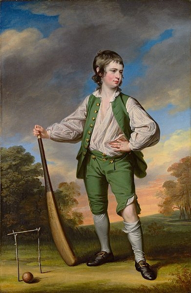
Francis Cotes, “The Young Cricketer” (from Wikipedia)

For his portrait of young Lewis Cage, the artist Francis Cotes chose a pose reminiscent of that of military heroes, hinting at the boy’s self-confidence. However, he immediately subverts this pose and we are reminded that this is a little boy, for in contrast to the men depicted in those military portraits, young Lewis looks far from neat and tidy: his waistcoat is unbuttoned, a corner of his shirt is hanging out of his breeches, which have become unbuttoned at his left knee. All those details add to the vitality of the portrait by hinting at the vitality and physicality of the child: he is dirty, sweaty, and stinky, but immensely proud of his achievements in cricketing.

And all those paintings of little children cuddling with their pets with obvious affection? How cute are those? Joshua Reynolds’ little “Miss Jane Bowles” (1775) exuberantly hugs her (long-suffering?) pet spaniel while smiling mischievously. And when Henry Raeburn painted his step-grandson in 1814 (“Boy and Rabbit“), he depicted little Henry as an affectionate young boy who tenderly cradles his white pet rabbit in his arm.

Posing is something I find rather difficult when I’m working with my digital models (and not the least because digital models don’t automatically pose naturally and, thus, if you don’t do it correctly you end up with a wooden-looking zombie — NOT the kind of look you really want to go for) (unless you’re doing a picture of a zombie, of course). To find the right pose (and the right camera angle) for a character often takes me quite a long time, and I typically need several test runs before I come up with something I’m happy with. As with those real-life portraits, it’s often the small details that add character to cover art.

A portrait of my centurion

A portrait of my centurion

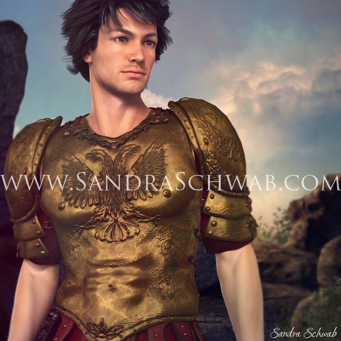
A few days ago I got thinking about what to do with the cover of THE CENTURION’S CHOICE.  Which of my two guys should I put on the cover? Lucius, whom I used on the teaser image? Or Caius, the centurion from the title of the novella? In the end I settled on burly, cranky Caius – and after some puttering around, I ended up with the above picture. (I wasn’t able to find a digital version of a centurion’s armor, so I put Caius in a set of shiny Spartan armor.) But somehow, it just wasn’t quite right. I mean, he’s a good-looking dude, yes, but he looks a bit young-ish, and besides, Caius is described as being built like an ox. And this guy isn’t quite what I would call burly. So…more tinkering ensued!

Luckily, the muscles of digital models can be pumped up on demand and so I did some pumping (gosh, that was too much….), tried to add some muscle definition to his lower arms, and…oh, what about body hair? *Sandy wanders off to investigate digital options of adding body hair, comes back slightly traumatized* Um. No body hair, sorry.

But I did change the camera angle somewhat and turned his hair windswept to make the whole thing look a bit more heroic. And finally, I ended up with – taaaahdaaaaah! – this cover draft. Which I quite like. 🙂 And I hope you do too!

Cover image of The Centurion's Choice by Sandra Schwab
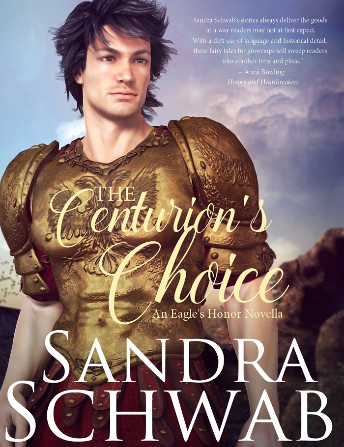
THE CENTURION’S CHOICE will come out in late November / early December and will be my very first m/m story.


Hello everyone! Gail Eastwood here. I’m popping in for a visit thanks to the kind invitation of our Risky hostesses, most particularly Elena Greene, who has given me the opportunity to guest blog on first Fridays of alternate months. I am delighted to be here to share your gracious company and conversation, and also to help Elena gain a little more time to work on her newest work-in-progress. I have read a little of it and can’t wait for her to get it done!!

Some of you already know me, or may remember that I wrote Regencies for Signet back in the day, but for those who don’t, here’s a link to an interview Elena did with me a few months ago on this blog. Coming back to the writing realm after ten years makes me feel a little like Rip Van Winkle at times, so much as changed! It is indeed a brave new world, but I’m excited to jump into it.

If I may beg your indulgence, for this post I’d like to go back to the topic of cover art, picking up from Elena’s post of Sept 14. Elena shared her dilemma over “branding” her sexy short story Lady Em’s Indiscretion through her cover art. My own dilemma, as I prepared the first e-book reissue that I am doing myself, The Lady from Spain, was whether or not to go with a cover style similar to what the new Signet reissues have, or try something different.

The Signet reissue e-books have taken a very different approach to their cover design, and I have yet to see anyone discussing it or reacting to it, and I’m dying to know what people think! Three of my books are being done this way.

As you can see below, I opted for “different” for the ones I am doing myself–all part of the grand experiment. For LFS, I wanted something that would suggest the suspense of the story and still atleast hint at the Regency time period. The story takes place mostly in London… The reissue of The Captain’s Dilemma, my French prisoner-of-war story pubbed in 1995, is not ready yet, but I will be working on converting it next!


Here are the old versions of those covers. You can see more on my website or on my author pages at Amazon.

What “branding” messages do you get from the new ones? Like them? Dislike them? Do you want to see the characters, and if so, do you want to see both hero and heroine? What would you do instead?
If you’re interested in covers and/or how the designs have changed over time, here’s a link to a great website devoted to covers done by artist Allan Kass, who painted many Signet and other covers over a long career. It’s fun to look for your favorite authors in the archives, and sometimes recognize a favorite book!
Finally, I’m offering a free copy of The Lady from Spainto one lucky commenter, whose name will be drawn and announced by next Friday. So, please, join the conversation! And if you’d like to be part of the drawing, please be sure to include your preference for Kindle or Nook (the only formats available currently) or if you’re willing to wait for one of the other formats which will be available soon. Oh, and your email address!
Thanks so much for letting me visit with you today!

I recently learned that there is a German Kindle edition of SAVING LORD VERWOOD. I’m excited to be out in four languages now (there are Dutch and Italian versions of LADY DEARING’S MASQUERADE).

I’m also impressed with this cover. I liked many things about the original Signet cover (pictured below). The hero looks right (and hot, which never hurts), the house is the right style and period, and composition is pleasing. My only slight gripe was that the heroine should be a redhead, not a blonde. Since she had already appeared as a redhead in two previous stories, I chose not to rewrite her description to fit the cover.

In contrast, the German cover accurately depicts both my hero and heroine. I also love, love, love that the artist took the time to recreate the stormy, craggy western Cornish coastline. This even looks like an actual scene from the book.

As an author, I love it when the cover art conveys my inner image of the characters and setting. As a reader, I used to be annoyed by cover art that didn’t match the story, but even before I knew about the cover art process, I guessed—correctly—that the authors might not always have much control over their covers. Now I enjoy it when a cover fits, but mostly I care what’s inside.

How do you feel do you feel about cover art being accurate to the story? What are some of the worst cover bloopers you’ve seen? Any covers that you thought suited the story especially well?

Elena
www.elenagreene.com
www.facebook.com/ElenaGreene

Today (or tomorrow) I’m the Take Ten With guest at Cover Cafe, talking about the bookcovers in my life.

We’ve addressed the topic of bookcovers a few times at Risky Regencies, most recently by Elena. It’s a topic I never tire of. I love how romance covers follow trends, like clinch covers and decapitated people. I thought I’d see what the current trends seem to be.
I peeked into Amazon, Barnes & Noble, and some Romance review sites and looked at the romance covers for October.
In Regency and Victorian historical romances the trend seems to be toward featuring the heroine on the cover, usually in a beautiful dress that might be half-off. Here’s a sample:

Interestingly enough, Scottish Historicals did feature the hero. And Westerns.

There were still a few traditional covers:
Funny, my recent covers show all the trends. Traditional. Hero-featured. Heroine-featured:

Do you agree with my conclusions? What trends do you see? What kind of covers do you prefer?
Speaking of covers….October 1 was the release for my new Undone short eStory. The Liberation of Miss Finch tells the story of what happened to Claude, the boy my three soldiers rescued at Badajoz. Check my website to see what else is new and to enter my contest.
Leave a comment on my blog on Thursday for a chance to win a signed copy of Regency Improprieties.

I want to talk about covers. Specifically, covers for reissued traditional Regencies. I’m looking into the idea of republishing my backlist and interested to see what others have done.

Some authors have gotten new cover art much in the style of the Zebra and Signet Regency covers. Shannon Donnelly has some very nice ones; here’s an example. The concern I have with these is the possible perception among readers that these books contain no more sexual activity than kissing. I’ve had some irate reader mail about my Regencies that had sex scenes and some Amazon comments to the effect that sex does not belong in traditional Regencies (or even that sex did not occur during the Regency!) Janet and I once had a chat about how readers might not expect a bondage scene in a book with this type of cover. 🙂

There are some lovely covers using period fashion plates. Here’s one through Belgrave House and another by Candice Hern. I think they’re great but they do seem best suited to the sweet traditional Regency.

Here are some other styles of covers I have found on Smashwords when searching for “Regency romance”. As far as I know, these are not reissues but they show a range of possibilities.


I like the use of period artwork, especially portraits. I pick books more by whether the characters seem intriguing than by the level of sexuality, so an attractive and interesting portrait will catch my eye.

I loved the first cover for Pam Rosenthal’s RITA-winning THE SLIGHTEST PROVOCATION, which featured a portrait by Sir Thomas Lawrence. IMHO this cover is sexy; it also promises quality writing and a period feel. Yet the book was reissued with this much less subtle cover. The Smart Bitches and their guests discussed the merits of each; opinions were mixed but I think pretty evenly divided between the classier vs the cheesier cover. I only hope the two covers helped the book reach a wider readership!

So what do you think? Which sorts of covers do you like and why?

How important is it that a book cover reflects the level of sensuality of the book, versus other elements?

What sort of covers do you think work best for books that fall somewhere between the sweet traditional and the sexy historical?

Elena

Follow
Get every new post delivered to your inbox
Join millions of other followers
Powered By WPFruits.com