
We haven’t talked about covers recently, have we?
For me, that’s one of those eternally interesting topics.
There have been so many styles of Regency covers over the years…
Over the decades, rather!


Different publishers have their different styles…
And these vary year by year, too!
I can think of at least three very distinct styles that Fawcett had, for example, and a lot of variations within each.
And some publishers, like Avon, changed their look so much at some point that they were really unrecognizable.
Some covers seem to emphasize the period style…
And some, the romance.


Some Regency covers seem to be shouting FUNNY! BOOK! NOT! SERIOUS!
(For me, most of Harlequin’s long-defunct Regency line falls into this category.)
On some books, the illustration takes up the whole front cover.
On others, the illustration is in a little box.


And then of course, there were Zebra’s last-minute experimental covers, which appeared right before Zebra quit doing Regencies.
These tended to not have a single distinct style (which, as far as I can
tell, is extremely rare in the history of Regencies), but rather to give each author her own unique cover style — the way publishers usually do with single-title books.
I know some people thought these covers were the best thing to ever happen to Regencies — and some thought them a very bad idea.
(I adored them myself. What did you think?)


Almost all covers have had one or both of the main characters as the central feature of the cover illustration, but even that isn’t an absolute rule.
Avon’s covers at one point were impressionistic pastel compositions, often showing landscapes or cottages or meadows, with little people somewhere in the picture.
This
Kate Moore cover is an example of that — though in many of the covers during Avon’s Impressionist Period, the characters are much less noticeable than they are here!
 So…which of the covers pictured here do you like?
Or hate?
Do you like a Regency imprint to have a distinct style?
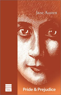
What do you think of less realistic covers (like the Heyer cover here, or cartoon covers?)
Do colors matter to you? Do you like pastels, or brights, or the muddy greens and browns Signet favored for many years?
Do historically inaccurate costumes or backgrounds bother you? If so, how much?
All opinions welcome!
Cara
Cara King, author of MY LADY GAMESTER — which has a cover that gave her some joy, and some eye-rolling
 Folks who’ve been reading this blog for a while know that I love to talk about covers…
 And whether it’s even possible for a bad cover to diminish one’s reading experience…
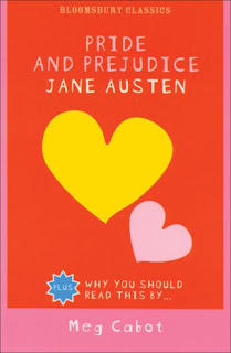
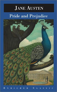
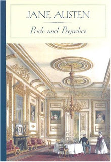
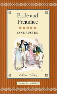
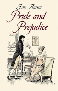
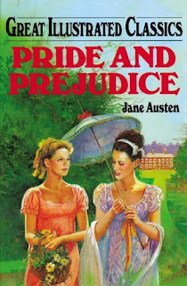
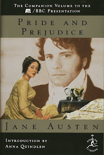
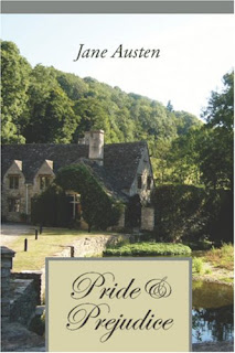 Here are a whole bunch of different Pride and Prejudice covers.
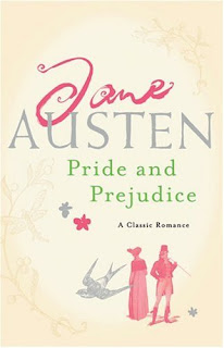
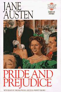 Which covers do you like? Which is your favorite? Why?
