


We haven’t talked about covers recently, have we?
For me, that’s one of those eternally interesting topics.
There have been so many styles of Regency covers over the years…
Over the decades, rather!
Different publishers have their different styles…

And these vary year by year, too!
I can think of at least three very distinct styles that Fawcett had, for example, and a lot of variations within each.
And some publishers, like Avon, changed their look so much at some point that they were really unrecognizable.
Some covers seem to emphasize the period style…
And some, the romance.

Some Regency covers seem to be shouting FUNNY! BOOK! NOT! SERIOUS!
(For me, most of Harlequin’s long-defunct Regency line falls into this category.)
On some books, the illustration takes up the whole front cover.
On others, the illustration is in a little box.

And then of course, there were Zebra’s last-minute experimental covers, which appeared right before Zebra quit doing Regencies.
These tended to not have a single distinct style (which, as far as I can
tell, is extremely rare in the history of Regencies), but rather to give each author her own unique cover style — the way publishers usually do with single-title books.
I know some people thought these covers were the best thing to ever happen to Regencies — and some thought them a very bad idea.
(I adored them myself. What did you think?)

Almost all covers have had one or both of the main characters as the central feature of the cover illustration, but even that isn’t an absolute rule.

Avon’s covers at one point were impressionistic pastel compositions, often showing landscapes or cottages or meadows, with little people somewhere in the picture.
This
Kate Moore cover is an example of that — though in many of the covers during Avon’s Impressionist Period, the characters are much less noticeable than they are here!
 So…which of the covers pictured here do you like?
Or hate?
Do you like a Regency imprint to have a distinct style?
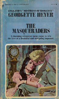
What do you think of less realistic covers (like the Heyer cover here, or cartoon covers?)
Do colors matter to you? Do you like pastels, or brights, or the muddy greens and browns Signet favored for many years?
Do historically inaccurate costumes or backgrounds bother you? If so, how much?
All opinions welcome!
Cara
Cara King, author of MY LADY GAMESTER — which has a cover that gave her some joy, and some eye-rolling
Oooooh, pretty!
I admit that I was partial to the Fawcett covers because I loved the Fawcett regency line in general.
But I love the old Heyer covers and wish that style would be revived. I suggested it once to an author and she said that she thought it looked too dated.
I respond to colors mostly though. When Signet Regencies went from the red&blue (hello! primary colors = good) lines at the top of the books that they had for YEARS to that powder blue/lavender, I knew the end was near 🙁
I liked the Signets before they ended and the Zebras right before the change at the end. But that’s how I was introduced to them, with those covers, so it’s what I was used to. I liked how the scene they did, they generally matched what was inside, if not precisely.
I’m not a fan of cartoony ones, unless the inside is more humorous — cartoony covers feel like they should be for comedies, but they aren’t always used for comedies.
And I really have this thing against headless people. I mean, geez louise, I never met a headless person so why should the people on the cover be like that? LOL
Lois
The artist for the Heyer books shown was Arthur Barbosa and I think his illustrations are magnificent works of art. I LOVE them!
See more here
I think the Regencies went astray when they redid the covers at the end. Readers could no longer tell at a glance that they were Regencies. I think they should have evolved the traditional covers but not so radically change them. Just make them less sappy.
I absolutely hate it when they get the clothing wrong. To me, seeing my hero on the cover of Innocence and Impropriety with his neckcloth tied in a bow bothers me each time! Each book I send several images of men’s clothing and they never get it right, exactly.
Of course, with A Reputable Rake, the cover model was so handsome, I didn’t care what he wore!
I like covers that reflect the contents. So although branding is important with a genre like traditional Regencies I did not care for the generic look. Angsty or sexy stories with covers that scream comedy of manners or worse, where the characters sport really vapid smiles.
Maybe if they’d done a similar format for all but allowed for more variation in the picture. Something that stood out.
In SAVING LORD VERWOOD the heroes rescues an orphaned seal pup. I thought that would be cool and different for the cover but the art department thought it was too cute. So they put ducks on instead. LOL.
I have to admit that I go by the back cover rather than the picture on the front, so that never really turned me on to or off of a book. However, I loved the old Signet Regency style – no matter the picture. You knew what you were getting in for, and I loved that. I could browse the shelves and tell by the spine what I was looking for.
I like the traditional covers pretty well, though not the older ones that were super inaccurate. I do think, though, that it’s unfortunate when the covers are all so similar that it seems like you could swap them around between books without anyone particularly noticing the difference. For that reason (among others) I liked the new Zebra covers.
I do really like those old Georgette Heyer covers, though. They’re pretty, and they say “Look! A Georgette Heyer novel!” 🙂
Todd-who-tries-not-to-judge-a-book-by-its-cover
London publisher Arrow’s new Georgette Heyer covers are beautiful. Take this cover of Beauvallet for instance, or Cotillion–so very distinctive.
Keira-who-does-judge-a-book-by-its-cover
I love the original Heyer covers–and thanks for the link, Diane. They have a timeless elegance that other covers lack.
I was interested to see that Arrow is using Victorian art depicting the Regency, because that’s what I have on my cover. Thanks for showing us those, Keira.
And now I really must go to work.
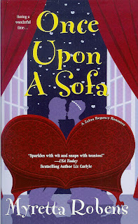
I liked my covers for Zebra. If nothing else, they really stood out. However, I thought the cartoon cover for Once Upon a Sofa was misleading. It wasn’t a romp and the cover made it look… light. But I loved the cover for Just Say Yes. It was a lighter book and the cover reflected it. Unfortunately, that’s all she wrote.
Myretta, that is a fabulous cover. I like the modern look while you can still tell it’s a Regency.
As much as I loved your books, Myretta, I was not a fan of those cartoon Regency covers. Unlike the Heyer Barbosa covers, they just did not convey the Regency world to me.
The covers based on art of the period or later Victorian depiction of the period are beautiful, but we are going to run out of images! And I’m not certain the three Regency girls convey Cotillion for me.
I do think that at the present time, Harlequin Historical are doing a good job on their covers, in spite of my neckcloth-in-a-bow fiasco.
I liked what Zebra was doing with their covers just before the line ended, but I can see the argument that they weren’t readily identifiable as Regencies. Still, I thought they were attractive and distinctive.
Unlike Lois, I like headless people. Partly because cover models almost never fit the mold of what I find hot–if Sean Bean, Nathan Fillion, Ioan Gruffudd, and the like were romance cover models, THEN I’d want to see their faces. (Or Ichiro Suzuki, though he’d look just an eensy tad out of place on a Regency cover. Hmm…now THERE’S a writing challege–find a way to write a Regency historical with a Japanese hero!) But I also think I’m drawn to incomplete images as I browse a bookstore, almost as if I have to linger over them longer so I can mentally fill in what’s missing.
I like the recent Harlequin Historical covers too–I feel like they do a good job of “branding” the books by genre and era while still looking fresh and classy.
I’m always looking for older traditional Regencies at my local UBS and thrift stores, and it’s fascinating to look at how much the book’s publication date influences the supposedly period cover–e.g. Regency heroines sporting blue eye shadow in circa 1980 books, Regency men in mullets a few years later.
For everyone who says “Oh, I love the Heyer covers!” I’ll just point out that there are three Heyer covers pictured, and I suspect it’s the last one that we’re all admiring. 🙂
The first, in particular, I find pretty dreadful!
As for which of the pictured covers I particularly like:
THE WICKED COUSIN
LARCENOUS LADY
ONCE UPON A SOFA (and thanks, Myretta, for giving us your opinion on your covers! very interesting!)
THE LADY FROM SPAIN
SYLVESTER
As for colors, I’m happy with brights or pastels… I just hate the olive and mud colors Signet used for far too long… (Always made the books look dreary…so I rarely read them in those days!)
Cara