
 A month or so ago I blogged about the agony and ecstasy of finding a title.
Little did I know then, but the title search was to go on… and on. Because the marketing department changed its mind about the one they’d chosen, and took it upon themselves to find one. I was all titled out and happy to turn it over to them. And today, we finally settled on one–Pride and Prejudice. No, just kidding. It’s The Rules of Gentility. Long ago I suggested Gentility Rules, which might be the sort of thing you’d find spray-painted on a wall in Highbury. (Another favorite was The Lady Vanquishes, apparently lost on a generation who didn’t grow up watching Hitchcock.)
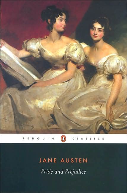
In all of this long, long process, I discovered I knew virtually nothing about how books are titled and the relationship of cover to contents, and now I think I know even less. I thought, for instance, that the cover had to reflect what was inside. Well, yes, sort of. I pulled some Jane Austen covers off the web to illustrate what may or may not be my point. Above left, Penguin Classics. The portrait is a detail of Double Portraits of the Fullerton Sisters by Sir Thomas Lawrence, and very nice too. The period is correct, but…wait. Aren’t there six sisters? And if the one on the left is holding a drawing board, I thought the Bennett sisters were remarkably unaccomplished by Miss Bingley’s or Lady Catherine de Bourgh’s high standards.
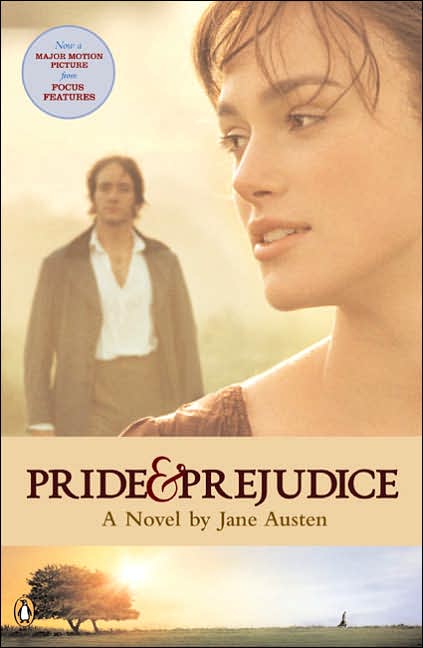 Our next entry is the movie tie in edition. Or, the book of the film. You mean, there was a book first? You could read the whole thing before getting to the scene where Mr. Darcy appears with, gasp, coat unbuttoned and cravat discarded. In fact, that scene is missing from every edition I’ve ever owned.
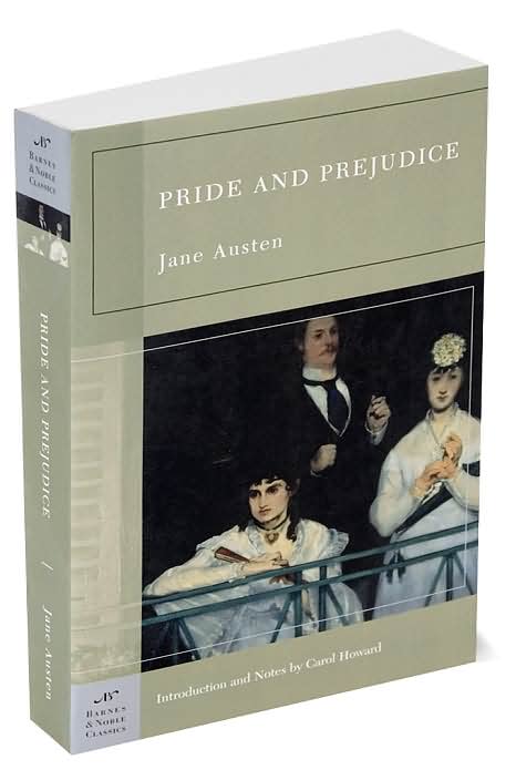 The next two I found are even more puzzling. At left, I believe the original is a painting by Degas. Only about a century too late, and which one is supposed to be Elizabeth? Is the other one Miss Bingley? Is there a scene where they sat at a balcony together?
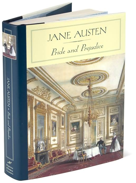 And the final one is of an interior with two characters in Victorian dress. Inexplicably, the gentleman is sitting while the woman is standing. My first thought, when looking at this, was that they were servants. It certainly doesn’t look like any sort of courtship scene. It rather looks as though the woman is receiving a scolding. “Rats in the soup again, Cook, and not nearly enough of them…”
One thing I did learn from my experience was that the cover does not necessarily relate to the contents. The other realization was that we, as book buyers, are fooled and deceived when buying a book. The marketing strategy seems to be that if a sort of book cover has worked well, it will continue to do so until…look at all the trends we’ve seen in romance–clinches, Fabio, mantitty, cartoons, more mantitty, pink and shiny, bumpy bits (those last two are not related to mantitty), photos. Why does the public fall out of love with a particular style? I’ve no idea. My book is a funny book but its cover will not suggest that because readers of historicals don’t like funny. The back cover copy will suggest it’s funny, but probably will not declare A laugh on every page! The first Regency-set with a fart joke! So the buyer, fooled into thinking they’re on familiar territory, will buy it.
None of the Jane Austen covers suggest that P&P is one of the wittiest books in the English language either. So it’s a mystery of the publishing business.
What makes you buy a book? And have you ever chosen one based entirely on the cover and been bitterly disappointed? Or found a gem with a totally unsuitable cover?
Janet
Once upon a time (when I was in school) I would stare at the cover of “Portrait of a Lady” or whatever and try to figure out who was which character, etc etc. Then I realized the pictures on the covers of classics have nothing to do with the inside — they’re almost always the wrong period, wrong number of people, etc etc. And far too often, the wrong mood.
But I expect they’re cheap. 🙂
I don’t buy for the cover, but I confess a nice cover may draw my attention to a book… And a really bad cover may put me off!
Cara
I’m with you, Cara – I’m easily swayed by a lovely-looking cover. In fact, when I was in college, I ended the library book-collecting contest with an entry unified almost solely by covers. All the art was the Pre-Raphaelites (or Thomas Canty) – I was going through a high-fantasy phase. 🙂
I’m really enjoying all the period art that publishers have recently been using for romance novel covers – very classy!
Best of luck in the cover wars, Janet – I’ll be looking for your book, no matter what it’s wearing!
I still think I found the weirdest P&P cover, on a Lithuanian translation I blogged about a while ago.
Back to historical romance covers, my favorite what-was-the-art-dept-thinking cover has to be the one for Cupid’s Darts by Karen Harbaugh. Too funny!
Anyway, I don’t buy for cover, I buy by author. They could put a closeup of a turnip on the cover of a Laura Kinsale and I’d buy it in a heartbeat.
I do love covers that use period art. Especially when they have some relation to the story. 🙂
Janet, here’s hoping you get a visit from the good cover fairy!
When I started writing, I would have said I’d never want a “mantitty” cover, or a clinch cover. But I’ve changed my mind. When RWA used to have a cover contest and display all the covers at the conference, I noticed that my eye was drawn to covers showing a hunky man. The flowers, the landscapes, didn’t attract me.
My friend Darlene was trying to figure out why one of her books (Superromance)didn’t sell as well as another. One clue was to put the two books next to each other. One was red and had a handsome man on it embracing a pretty woman (both dressed); the other used pastel colors and had a woman reaching up to pick an apple-a totally generic cover. Which would I pick up to read the back cover copy? The red book with the handsome man.
The month The Marriage Bargain came out (which has a beautiful cover- handsome man, beautiful blue tones) I did a booksigning at NJRW conference and I sat next to Jenna Peterson whose first Avon book came out, Scandalous, the same month. Even though I had a huge poster with my beautiful cover, passersby were attracted to Jenna’s green, clinch cover.
So I’m a real convert to the “mantitty” cover. They attract readers–even me–and sell books!
Diane
The cover may catch my eye, but it isn’t why I buy a book. When actually buying a book, first I look for authors I like. If I’m looking to expand my tastes, I ask my best friend, and she blessedly introduced me to Diane Perkin’s books. I did take a chance on Anne Gracie’s “Perfect Waltz.” Amazon did one of those “People who bought such and such also purchased…” I was feeling adventurous and loved it. It’s also how I discovered Elizabeth Rolls. I decided to try “Lady Gamester” because I enjoyed Cara’s writing here. There are also a couple of other authors I’ve tried because of what I’ve read here, including Jane Austen.
A cover might catch my eye and make me pick up the book, but I won’t buy it just because of that cover (even if I’m tempted! My credit card would scream in pain if I bought every cover I liked!). A long time ago, I would use covers to tell if it was one of the subgenres I was interested in, but now I can get burned by that. A melodramatic saga might have a cartoon cover, or a Regency historical a girl in a Vera Wang bridal gown!
I love the covers that use historical paintings the best. Close-ups of old portraits and things like that usually pull me in. 🙂
Janet wrote:
The period is correct, but…wait. Aren’t there six sisters?
Uh…well, not to be needlessly nit-picky, but there are five sisters. 🙂
Todd-who-is-also-remarkably-unaccomplished-by-the-standards-of-Lady-Catherine-de Bourgh
The cover plays a huge part for me, as does the font, and overall design. The title, as discussed earlier, is even more important. And the author’s name tops the list.
Amanda wrote… “I love the covers that use historical paintings the best. Close-ups of old portraits and things like that usually pull me in.”
I love Candice Hern’s covers (latest two). Simple gorgeous!
Diane wrote… “So I’m a real convert to the “mantitty” cover. They attract readers–even me–and sell books!”
Wow! I remember the “euuuu” of a few months back. This is a rather quick transformation. Was Gerry responsible for this change of heart and mind?
Oh, of course, five. Silly me. I must have been counting the mad one in the attic. Thank you, Todd.
Fine art covers don’t come cheap, Cara. The publishers have to pay a copyright fee to the owner of the painting, although I don’t know whether that’s cheaper than in house design. But I love the use of fine art on covers–and I hate the clinches and seminude bodies covers. I don’t get the whole waxed, buffed, buff male thing. They don’t even show the interesting bits, so what’s the point?
Janet
Mantitty covers leave me cold too, Janet. To me they scream that there will be sex in the book but sometimes the faces aren’t shown, or if they are, the guys often have this dazed or drugged out expression. I can’t see why a heroine would risk blending genes with them.
I do like the ones that feature interesting men’s faces, like Jo Beverley’s three guys called George. They all look like they’ve got brains; I feel safe in assuming they’ll be buff, too. Maybe that’s the thing: muscles are pretty but anyone can have them. I want to know what is special about this hero of this book versus any other.
But I do understand what Diane is saying–I want covers that sell, too! Maybe the appeal of the mantitty covers is that they promise a sexy read. Perhaps the buyers assume the hero will have brains/character to match the muscles. For me it just seems to be the other way around. 🙂
When I first started reading romances I use to choose books by their covers first, then by the blurb on the back cover. After several books where the cover was so misleading I became disappointed by the covers. Now I’ll buy a book without even looking at the front cover and after I read the book I’ll look at the cover to see how close they came to the story and it usually makes me laugh or shake my head. The only thing I want the front cover to be now is pretty enough to display and not too graphic so that I can read it whenever I get the chance, when I carry it around with me, such as at the doctor’s office, etc. ~Wanda
A cover alone usually won’t make me buy a book, although I admit to being that shallow once or twice (or maybe more, but I won’t say). Diane’s covers are among the best I’ve seen precisely because the men are so handsome. I’d pick up “The Marriage Bargain” before “Scandalous” any day — the guy on that cover looks like the falling shirt somehow cut off the circulation to his brain (or maybe it’s that I don’t ascribe a high IQ to someone who can’t keep his shirt on properly) and can’t compare to the absolutely gorgeous Nathan Kemp (or whoever it is). I also love historical paintings or ones that look like paintings, as long as they are period appropriate. Good examples are Mary Balogh’s Mistress books and Candace Hern’s Widows series. Much as I love Degas, his women aren’t right for Austen covers. Some of the older Signets had drawings of handsome men who looked right for the part, and since I started seriously reading romance with these books, I have a certain affection for the style.
OK, I know we’re supposed to be talking about fine art covers for romances and for classics, but this was the cover that made me want to buy the book last night, even though I’ve got more than enough versions of Sade’s Philosophy in the Bedroom at home already… but wait! Not that translation! Not that intro (Francine du Plessix Gray is terrific)! Not that cover!
Pam (hightailing it back to the bookstore)…
Pam,
That cover, while more explicit than a clinch cover, has graphics chops most clinch covers can only dream about. Belle Epoque poster art style would make fabulous romance covers for anyone writing stories set around then.
Jane
PS Was the book still there?
Susan/dc, thanks for saying you’d pick the Marriage Bargain over Scandalous because of the cover!
Keira, I’m not really too fond of the clinch cover but put a handsome man on the cover and use vivid colors and there you go.
My favorite cover of mine is the Harlequin Historical versio of A Reputable Rake. Oh, sigh! I want to buy that book and its mine!!!
Diane
Oh, yes, indeed, Diane, he looks just like Cyprian! Gorgeous. Which reminds me of something that really irritates about bookcovers: when the couple on the front look nothing like the couple in the book! I just read one where the man was described as blonde and the woman a brunette, and on the cover the guy had black hair and the girl was a platinum blonde! ACK! I hate thinking about how many times I checked to the cover thinking it would somehow magically get the right hair color on the right person. I’d prefer no people at all if they can’t get hair color right. I know, the artist probably knows nothing about the book, but still, it’s annoying. Okay, it isn’t really worth the energy to be annoyed, but it is distracting.
Yes, Jane. The book was still there and now it’s all MINE. And the BACK cover, btw… an “after” to the “before” of the front cover, is even hotter. And very Sadean.