

A few days ago, I got a packet of cover flats for my next book, A TANGLED WEB. I like it all right–the purple color is very pretty and rich, the couple not quite as cute-sy as some (though that scene never really happened in the story, and the heroine would NEVER wear purple polyester!). But it made me start thinking about a subject near to every author’s heart–covers. The good, the bad, the ugly.
For better or worse, a cover (something we have zilch control over) can have a huge influence on sales. A vivid, beautiful, interesting cover can grab a reader’s eye and make them pick the book up off the shelf. A bad, ugly, or just plain bland cover can mean that the book, our “baby”, is overlooked, turned away from, even (gasp!) made fun of. (See the hilarious Worst Cover category in AAR’s annual cover contest).
These days there is a vast array of styles out there. There are still old-style clinches. You know the ones–anatomically improbable people falling out of their clothes, bent into poses that would mean a trip to the ER in real life and months in traction. Or my personal cliche favorite, one which seems to pop up often at Avon, the bacon-brained hero who forgot to put his shirt on before running out into the snow after the negligee-clad heroine. But he DID remember his cheesy Wal Mart vampire cape.
There are cartoon covers, some of which are cute and suit the story, some just–weird. There are flowers, castles, pearls, and other inanimate objects. There is hero alone (usually displaying his manly chest), heroine alone, headless people (I actually like these very much), classic paintings. A few I’ve noticed lately:

 Liz Carlyle’s ONE LITTLE SIN–headless people, great, bright colors, very eye-catching and sexy without being ludicrous. She’s had several great covers. I’m jealous.
Gaelen Foley’s ONE NIGHT OF SIN–personifcation of headless couple-dom. Red background, very sexy.

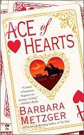 Barbara Metzger’s ACE OF HEARTS–her previous historicals had that nice headless couple design, misty colors, very pretty, but this one–WTF? Looks like some weird Halloween Western.
Laura Kinsale’s SHADOWHEART–amazing book, boring cover. This story screams out for a gorgeous Italian Renaissance painting. Maybe a detail of a Botticelli?

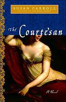 And speaking of paintings, there are Susan Carroll’s THE DARK QUEEN and THE COURTESAN. Again, amazingly terrific books. They look good, too, trade size, 1/4 bright foil, 3/4 a detail of a beautiful painting. BUT–the stories take place in the 16th century. DARK QUEEN features a fluffy Boucher painting; COURTESAN a portrait of Empress Josephine. Very distracting.
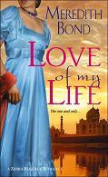 Meredith Bond’s LOVE OF MY LIFE–one of those gorgeous Zebra covers that didn’t get a chance. Headless heroine in a vivid turquoise gown, Taj Mahal in the background. Great.
So, what covers do you like/dislike? What would make you pick up a book–or run away screaming in horror? What are some all-time favorites?
Amanda:
I don’t mind the Avon covers for their clinch-dom, but I wish they would look different from each other–I realize it’s branding, but the covers all look the same.
I love the half dozen or so latest Carlyle covers. One cover I think suffers from its blahness is Lisa Kleypas’s latest “Autumn” book. It doesn’t look dangerous, exciting, fun! Sabrina Jeffries’ covers are big, fun and sexy, like the books inside, and I like the headless torso covers, too. Not so much the strand of pearls or bunch of flowers or something. I like the purple on your cover, too. Very striking, for a clothed couple.
Okay, so would it kill me to answer the question?
My favorite covers are Julia Ross’ trade pbs–very indicative of the lush prose within. The Fabio-era Laura Kinsale covers are atrocious, as is Deborah Simmons’ The Maiden Bride (medieval. bad.). I was actually embarrassed to read that one in public (on the subway, usually), and normally nothing phases me.
I don’t like trad Regencies if they’re too precious, but they’ve been pretty good lately. Zebra did a great job with their trads before scrapping the line.
I’m really not thrilled with those cartoon covers. . . even if it’s a nice one, sometimes it gives the wrong impression. It could be a serious story, but the cartoon cover gives a totally opposite impression. But other than that, most of the time, they are just silly looking. But I’m sure I’ve liked one or two, just can’t think of any off hand! LOL But even if in yours the scene didn’t happen (think you mentioned that. . .), I’ve always really loved the Signet covers. Maybe, lack of a better way of putting it, because you can always take those seriously compared to some, you know? 🙂
I do like your new cover Amanda. Hey, more books! Do you bribe the cover artists to put bookcases on all your covers??? 🙂
Actually, it reminds me a lot of Laurie’s new cover. Wonder if it was the same artist?
I really like both of those Susan Carroll covers. I know, wrong period(s) and all — but from a practical viewpoint, I think they’re gorgeous, and I bet they sell the books. 🙂
I am a huge fan of all those “new style” Zebra covers — just fantastically gorgeous. Judith Laik had lovely silhouette covers, Myretta Robens had cartoon covers, Leanne Shawler had hunky guys (or at least, their torsos). 🙂 And yes, the backdrop on that Meredith Bond cover you posted is highly evocative…
You know, it never occurred to me that Barbara Metzger’s new cover looks sort of Western…but now that you point it out, I definitely see it! Attractive cover nonetheless, IMHO.
Cara
Ah, I forgot to ask my cover questions! For those of you who are new here, I’ll mention that covers fascinate me — as does the process by which authors make suggestions to the cover artists, and then are either ignored or listened to (usually both)!
So, Amanda — you say the scene never really happened in the story. But is this a version of one of the suggestions you sent the cover artist? (If so, was it your first suggestion, second, or what?) Do the characters look right? How much of what you suggested ended up on the cover?
Inquiring Caras want to know… (Okay, there’s only one of me…at least on good days…)
Cara
Okay, I noticed something. Amanda, I think your heroine is wearing my heroine’s dress! Obviously my Atalanta got tired of always wearing blue and gave her dress to her friend, who let out the bodice a bit (your heroine seems a bit curvier than mine) and dyed it purple — but it’s still the same polyester dress with a satin ribbon around the middle. (You can see my cover at http://caraking.com/Books.html to compare…) 🙂
And I have a sneaking suspicion that my heroine might have originally inherited her dress from Lady Dearing or even Fabienne…. 🙂
Cara
I like the Julia Ross covers, too. Mary Balogh has had some beautiful ones as well, and the latest Loretta Chases (so unlikely the silly clinch on LORD OF SCOUNDRELS which deserved something much better).
I also like covers that feature something of the Regency setting, whether a London street or (my favorite) a view of a stately home in beautiful grounds.
Elena, back to identifying with Elizabeth Bennett about Pemberley (OK, and its owner, too) 🙂
One family of covers I love are the ones for Phillipa Gregory’s books which have headless figures wearing gorgeous clothes sort of streaked with gold. I really can’t explain the artistic process–but they are beautiful!
I love “The Other Boleyn Girl”–sort of like the Sopranos in the Tudor court, and the writing is wonderful.
Janet
Cara, I believe it IS the same dress! I guess our heroines go to the same modiste. At least it’s not that pink and blue, floral-striped thing that I think Zebra used on about 400 covers. And I DO bribe the cover artists to include libraries whenever possible. 🙂 My hero and heroine do meet in the library once, but it’s (of course) at night. And they don’t look at all like the people in my head–Tom and Diana are a sort of “Persuasion” couple, they were young sweethearts before her family parted them, then they meet up when they’re older. These two on the cover look like they should be at a frat party somewhere. But it still looks fine. 🙂
Janet, totally agree on the Gregory covers. I love those books, and the shiny, headless covers just fit them somehow. The Queen’s Fool is my favorite, but The Other Boleyn Girl is great, too. Somehow I wasn’t as crazy about The Virgin’s Lover, but still liked it. Those wacky Tudors. 🙂