
Okay, the next time you see a modern Regency cover and get frustrated that there’s a zipper there — remember that it could be worse! Regency covers nowadays, even at their very worst, are mostly historically accurate. In the past, even Georgette Heyer had some atrociously anachronistic covers. (Though I must admit, some of them were charming.) 🙂
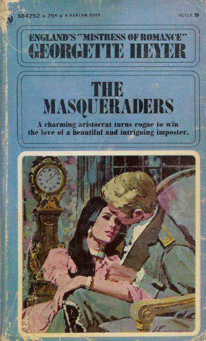
This Heyer I admit I don’t find so charming. If I were in a bookstore looking at the book, I would mostly find it dull and drab — as well as, of course, a bizarre choice of clothing for a novel set during the 18th century. This is a Bantam edition from 1969. The hero has a very modern hairstyle, and — well, looking it over, I think the artist may have actually intended for the picture to be of a 1969 couple. But there were so many very inaccurate covers in the 1960’s — showing that clearly many artists had no concept of how period clothes were made, and the like — that I think it’s often honestly hard to tell if the picture was mean to be period or not!

With Megan Daniel’s “Miss Pennington’s Choice” we have the Regency flapper. True, the scene is at a masquerade — but what a clever costume, to see a hundred years into the future! This was published by Berkley through their Charter imprint, in 1988. Though looking more closely, I have decided that she isn’t even a 1920’s flapper — she’s a 1988 woman, complete with 1988 makeup and earrings, in a costume. (No flapper worth her feathers would have had cleavage like that! They all wanted to look like they had the figures of twelve-year-olds.) From a marketing point of view, the cover has its assets — it is bright and lively, and conveys a scene as well as a relationship.
That’s the most recent cover I have posted here — most are from the 1960’s.

Here’s a 1977 Ballantine edition of Alice Chetwynd Ley’s 1966 “The Master and the Maiden.” Here we have a Victorian lady in 1812! And I’m amazed by the detail the artist went to to portray a vastly inaccurate costume. The gentleman is much less detailed — but equally anachronistic, I think. The scene is somber, with a bizarrely spotty background. It does convey some emotion, but it certainly doesn’t look like a fun book.
Though, to be honest, I suspect it is also a fairly serious novel — I haven’t read it (at least, not recently enough to remember it), but it begins with an author’s note saying it is based on the Luddite Revolts. No, not light-hearted stuff.

In this 1968 Ace Books edition of Elizabeth Renier’s “The House of Granite” , we have a Regency hero with a 1960’s heroine. Hmm…. The art is simple, and a little weird — bold black lines around everything, lending an almost cartoony look on first glance. On second glance, I see the artist has gotten a surprising amount of detail in. I hate her dress, and the overall look is too Gothicky for me (I was never into books with heroines in nightgowns running away, and this has a bit of that feel), but for its era, it’s not actually that bad. (Which isn’t saying much, is it?)
The SeBastian cover is my favorite, in the same way that Wickham was Mr. Bennet’s favorite son-in-law. Yes, believe it or not, this book is set squarely during the Regency. But not only is the heroine in 18th Century dress, with a faux medieval hairstyle (!), the colors of her dress are hideous. This atrocity was committed by Popular Library in 1978. And even from just a marketing standpoint, I think it’s a terrible cover. It looks childish, and the heroine looks terribly passive. But I notice that the heroines on the Ley and the Heyer covers look quite passive too — I suspect it was the style of the period….
Cara
Cara King, MY LADY GAMESTER, Signet Regency 11/05
www.caraking.com
The Masquerader. Hmm. Scary, not in a 60s dollybird way, but in an 1880s Jack the Ripper Way. Why does he have a disembodied female arm on his leg and why is she unaware of it? What exactly is she doing with her right arm? Is he, in fact, conscious? His head is
at a very strange angle. Her eyes look funny, too…has a terrible crime(other than the one against good taste), a double murder, been committed on this cover?
Miss Pennington’s Choice. Well, it’s obvious. She’s a drag artist. Who else would have bosoms like that? I’m not sure the spidery hand on her hip belongs to anyone we can see on the cover–more like someone clawing their way up
her body.
The Master and the Maiden. The odd position of her legs and her generally distracted air suggests to me that King Lud is hiding beneath her skirts. Yes, she’ll do anything for the cause.
House of Granite. Another horrible murder. Blood streaming from an
abdominal wound, the heroine attempts to flee from the monstrous psychopath, the Man With No Mouth.
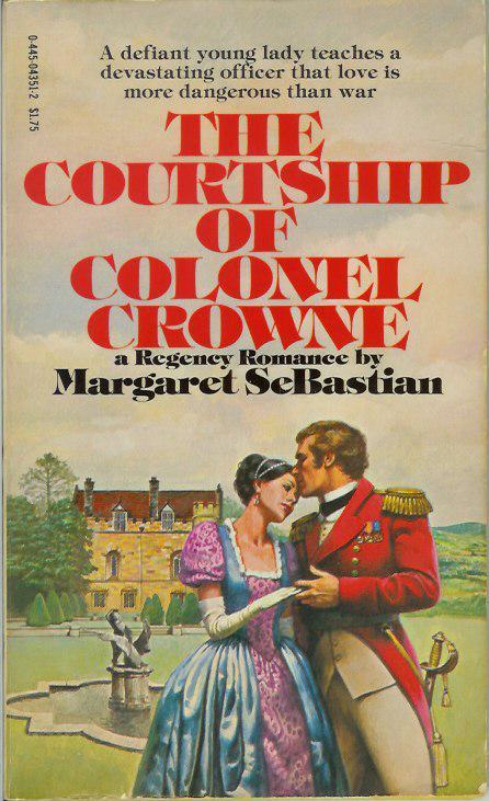
The Courtship of Colonel Crowne. Carefully balancing a hairbrush on one shoulder, the hero sniffs the heroine’s hairline. Yes, the colonel of coiffeure is about to save the day…
Janet
Cara:
Thanks for posting these! And if you have them, promise to post more. I am loving the covers, I used to use old category covers as wallpaper (my husband and I still wonder what “Helping Dr. Medway” was all about).
Anyway, thanks!
The cover for Renier’s “The House of Granite” looks like it was assembled with Colorforms. Either that, or the artist (a loosely used term here) used cheap cardboard dolls and pasted them — no doubt with thick glue and a crusty brush– over the cut-out picture of a castle. He then, apparently, outlined it all with the stub of his favorite black Crayola. I can hardly believe this was published!
Oh, I remember Colorforms! Those were so cool. Or at least, I thought so when I was six… 🙂
Janet, loved your interpretations of the covers! You are definitely insane. Very fun for the rest of us.
Megan — as for “Helping Doctor Medway”, it was obviously a typo. It was “Helping Doctor the Midway” and was all about a young woman lured into a sleazy life of rigging hoop-toss and skeeball games, who falls in love with the barker for a carousel until she finds out he’s really a dog…
Cara
Wait–after that, Cara, you want us to believe Janet is the insane one?
I wonder when romance covers will ever match their contents. Or when any of the guys will look even moderately attractive to me.
My insanity does not disprove Janet’s!
Cara
Good point.
Fashions in covers definitely change over time, for reasons that aren’t very clear to me. The covers Cara posted were particularly atrocious–but it seems like back in the sixties and seventies, as far as historical accuracy or even artistic quality, nobody much cared.
Of course, sometimes old covers can still be fun–like the lurid covers on some fifties books, that you can now buy as postcards:
http://www.pulpcards.com/
Or there are the old pulp SF magazines, where scantily-clad damsels (wearing very uncomfortable-looking aluminum brassieres) are threatened by Bug-Eyed-Monsters:
http://www.cyrune.com/pulp.html
But in actual quality, the covers of today probably stack up pretty well.
Of course, the fact that Megan never finds the men on the covers even moderately attractive is easily explained. As soon as publishers stop putting these tall, handsome, athletic men, with their bulging muscles and flowing locks, and put on what women really want–namely mild-mannered but essentially hot college professors–they won’t be able to keep the books on the shelves!
Todd-whose-manners-are-mild
Todd:
I’m partial to mild-mannered but essentially hot college professors myself–the cover models are handsome, sure, but they look dumb. The sexiest man is one who I know can challenge me intellectually.
I knew it! Ah, when will the marketing departments learn?!
I’m not sure the cover models are actually dumb. They just use their brains for other things. For instance, knowing the proper application of mousse. Or possibly caribou. I’m not sure–I don’t know these things, you see…
Todd-who-harmed-no-elk-in-making-this-comment
LOL, Todd!
Actually I find intelligence attractive too; it’s probably why the naked male torso sort of covers don’t actually do that much for me.
Some covers I do like are the Jo Beverley ones that have the gorgeous heroes on them (like the Three Heroes cover).
Elena
Fascinating tour of some interesting Regency covers – thanks!