 I meant to post this earlier. Anyway, here ’tis!
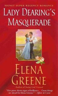
The heroine looks exactly right; the hero not quite. When you look close (fortunately the image is small) he looks a bit geeky, not at all like Colin Firth whom I used in my mental film of the story. But I do like the open shirt; it is actually right for that scene as I have Sir Jeremy doing some gardening on a hot day. Of course, going without cravat, coat and waistcoat is half-naked for a Regency gentleman. 🙂
And I like the red background. My editor asked me if I’d like pink or red and I chose the latter as more eye-catching and suggestive.
The scene itself was my second choice. My first was the initial masquerade scene, in which he’s in black and she’s in white. I think that would have made for a more bold, graphic effect against the red and also tied in with the title. This one is nice, though a bit pastel-y against the red.
Overall, though, I’m happy with this cover. And a bit stunned to see my name in such large letters!
Elena
www.elenagreene.com


