Back to Top

Category: Reading

Posts in which we talk about reading habits and preferences


Almost every Wednesday evening, I get together with a group of friends for a LOST watch party. And yes, it’s mostly an excuse to drink wine and ogle the actors when they’re all sweaty in the jungle, but after the Chardonnay there are sometimes attempts at deciphering character development/overlapping themes/whatever. One of my friends suggested that which guy on LOST a woman likes can tell a lot about her. (I happen to like Sawyer–not sure I want to know what that says about me!!!)

Anyway, that, along with Cara’s post on Austen movie heroes, got me thinking about heroes in romance novels. They are, of course, one of the most important components of any story. As an author, you want your readers to fall in love with the heroes you write about; as a reader, you want to do the falling in love. But every woman who reads a romance (just as every woman who watches LOST!) is different. I happen to like a “dark” hero, though I have found there is often a fine line between “dark” and “whiny”. Dark–yummy. Whiny–not so good.

Someone asked me once how I keep from falling in love with the heroes I write. I have to say, 1) they’re not real, duh. They live in my head. And I know that. Most of the time. And 2) I don’t really write my “fantasy perfect man”, though they usually do have aspects that I admire in real life (intelligence, humor, ripped abs, whatever). I write the hero that is perfect for that particular heroine. I want to believe, once I finish writing a manuscript or reading a book by a favorite author, that these two people were made for each other and will be able to weather life’s storms together forever.

So, I took a look at my keeper shelf and came up with this list of some favorite romance heroes (mostly Regency-set, but I let a couple others sneak in):

1) Lord Dain from Loretta Chase’s LORD OF SCOUNDRELS
2) Lord Rival from Diane Farr’s FORTUNE HUNTER
3) Lord Lucien from Gaelen Foley’s LORD OF FIRE
4) Sir James Stoker from Judith Ivory’s SLEEPING BEAUTY
5) Ruck from Laura Kinsale’s FOR MY LADY’S HEART (probably the #1 romance hero I wanted to come to life!)
6) Lord Michael Kenyon from Mary Jo Putney’s SHATTERED RAINBOWS
7) Captain William Chartwell from Mary Blayney’s THE CAPTAIN’S MERMAID
8) Alverstoke from Heyer’s FREDERICA
9) Edgar Downes from Mary Balogh’s A CHRISTMAS BRIDE
10) And one of my newest favorites, Adam Ashworth from Janet’s DEDICATION

So, now it’s your turn! Who are some favorite heroes, and why? What aspects of a hero’s character do you like to see in novels (besides great hair and a cute behind!)? And who is your favorite on LOST? 🙂

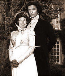
(BTW, the pic was a gift from a Photoshop-gifted friend who helps me indulge my Orlando Bloom obsession once in a while. Do you think I make a good Lizzie????)

Posted in Reading, Regency, Writing | Tagged | 17 Replies

Here are some Regency covers I really like! They’re shown here in approximate order of publication.

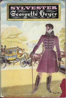
This Georgette Heyer cover is done by the famous cover artist Barbosa, for the 1957 SYLVESTER: OR, THE WICKED UNCLE released by Heinemann. I love the coach in the background, and the way Sylvester dominates the picture. He’s standing in shadow, too, to make him seem just a little bit mysterious…or wicked. Our Sylvester has no false modesty; he says “there are not five but a dozen young women of rank and fashion who are perfectly ready to receive an offer from me.” Hmmm…definitely needs to be taught a lesson!

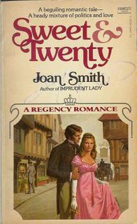
Joan Smith’s SWEET AND TWENTY (Fawcett, 1979) has a charming cover. I love the shops in the background, and the pretty young thing center stage. What I find really intriguing is that this pretty young thing is not the heroine, but her empty-headed cousin! In chapter one, this creature exclaims, “Cousin, have you read a book too?” in wonderment. Ah, silly young ladies. Gotta love them.

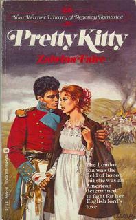
In 1981, Warner brought us PRETTY KITTY by Zabrina Faire. (Yes, it was a pen name!) I love the heroine’s big eyes and curly hair, and the action-packed background (a city in flame, with cannon firing at it? You don’t see that on every Regency cover!) The hero a bloody bandage, too–and a lovely sword. Ah, those military heroes… He inadvertantly compromises the heroine, and then becomes engaged to her, without ever knowing her name!

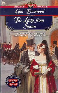
I was never the biggest fan of Signet’s older covers, the ones that tended to shades of brown and olive–they always looked rather dreary to me. But some of them were lovely, such as this 1997 cover for Gail Eastwood’s THE LADY FROM SPAIN. I think the colors go wonderfully together, and the entire composition is just pleasing to the eye. The carriage and horses in the background is a plus! The hero is dapper, and the heroine’s costume hints at interesting things. Indeed, on the first page we learn of her: For now it suited her purposes to be taken for a foreigner… Definitely intriguing!

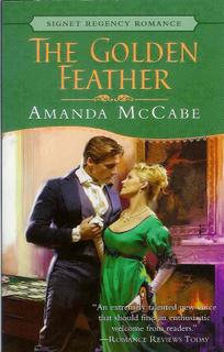
Here’s a lovely cover for Amanda McCabe’s 2002 THE GOLDEN FEATHER. What makes this cover stand out for me is the lighting — the whole feeling here, the mood, the mystery is created by the way the artist handles the light. The gaming table in the background promises interesting historical detail, and heroine’s mask hints at an intriguing character! And at least part of the picture is accurate; when the hero sees the heroine, he notices: Mrs. Archer was very striking. And she did indeed have a magnificent bosom, its whiteness set off by the low bodice of her green satin gown.

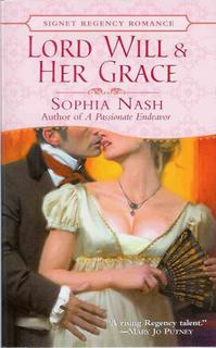
Here’s one for Amanda, who loves headless characters! Well, these are half headless, anyway. A lovely and unusual Signet cover, from April of this year, for Sophia Nash’s LORD WILL & HER GRACE. So…is the heroine kissing him? Turning away as he tries to kiss her? Ah, the questions this covers creates! The pose looks simple at first glance, but another look shows the tense way she holds her fan, and the way her body is turned quite away from him…definitely makes one want to find out more!

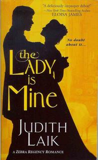
Here’s one of Zebra’s gorgeous covers from earlier this year — May, to be precise — for Judith Laik’s THE LADY IS MINE. I love the silhouette (and her later book had a similar silhouette, but with purple in the background). It’s elegant and lovely, and very very Regency. Even better, if you look closely, you can see all sorts of things in the yellow background! Definitely one of my favorite covers. It doesn’t reveal much about the story, but a cover like this doesn’t need to…even for a hero who talks about potential brides thus: “After all, one can’t spend all one’s time in bed. Over the years one will occasionally have to chat with the woman.” Hmm…perhaps another man who needs to be taught a lesson! 🙂

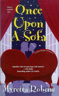
I positively adore this cartoon cover for Myretta Robens’ ONCE UPON A SOFA, which was another May 2005 release from Zebra. It’s funny, it’s catchy, it’s bright and colorful, and it’s very very new. The colors, the composition — everything is perfect!

So — which of these covers do you like best? Why? What sort of covers do you like in general? (Amanda doesn’t have to answer — we know she likes headless people best! BTW, Amanda, are you a fan of Washington Irving, by any chance???) 🙂

Cara
Cara King, www.caraking.com
MY LADY GAMESTER, Signet Regency November 2005

Posted in Reading, Regency | Tagged | 11 Replies

No, this isn’t about the upcoming new movie adaptation of THE LION, THE WITCH AND THE WARDROBE, even though I’m eagerly looking forward to it.

It’s about reader mail and its effect on the writer.

First I have to say I’ve enjoyed all the reader mail I’ve received so far. Most of the letters I’ve gotten were from people who enjoyed my books, along with a few from people who just wanted to share something they loved about the Regency. Even when readers don’t care for my books, it’s fascinating to find out what they are thinking. This one, from a reader I won’t name, is no exception!

Elena Greene:

My Lion roars his disgust, as to (sic) I after wading thru page after page of explicit sex in Saving Lord Verwood which I just finished. Yuk!

You are an excellent writer and the plot was good keeping one’s interest. I know explicit sex (leaving nothing to the imagination) seems to be the in thing. Surely with your writing ability you do not need to pander to or wallow in the antics that go on in the bedroom. Hopefully the trend will turn again toward decency.

With kindest thoughts I remain a Regency reader.

(name excluded)

P.S. Would you really want your young daughters to read such trash?

Initially, I felt a bit stunned by this letter. I’d never received anything like it before, and it wasn’t as if I were the first author to put a sex scene into a traditional Regency. But mostly, I wondered whether I’d slept through writing all those pages and pages of “explicit sex”! Had the copy editor gone wild with it? I reopened the book and looked through and yes, the love scenes were there, just as I’d written them, not particularly graphic at all.

The adult part of me (that sometimes thinks it’s in charge) shook off the label of “trash”. I don’t write with the intent of offending anyone, but I know I can’t please everyone either. I am not writing children’s fiction, so the postscript didn’t shame me the way it was clearly intended to. So I exchanged some emails with my critique partners and we all laughed it off.

However, there’s another part of me–the subconscious mind, the muse, the inner artist child–call it what you want, it’s the place ideas come from. That part of me wants desperately to please everyone. Soon after receiving this letter, I reached the wedding night scene in LADY DEARING’S MASQUERADE and found myself battling a fierce writer’s block. Finally until I realized that I was trying to write a scene that would 1) show, in a tender and realistic way, how the hero/heroine had overcome the problems of their earlier unhappy marriages and 2) not offend readers like this one. Rather impossible!

So the adult side of me counseled the kid. I told myself that one person’s spice is another’s poison and I had to be true to my voice and my characters. I also reminded myself that this particular reader had forced herself to read it, “page after page”! Perhaps writing the letter was just a way of easing her conscience over enjoying it?

Anyway, so far readers and reviewers are praising LDM. If at some point there are those who disagree, I can deal with it. Sometimes feedback may lead me to change my future work, but sometimes it just clarifies who I am as a writer.

So, my fellow authors, how do you deal with less-than-positive reader mail?

And readers, do please keep those emails and letters coming!

Elena 🙂
www.elenagreene.com/

Posted in Reading, Regency, Writing | Tagged , | 10 Replies

Okay, the next time you see a modern Regency cover and get frustrated that there’s a zipper there — remember that it could be worse! Regency covers nowadays, even at their very worst, are mostly historically accurate. In the past, even Georgette Heyer had some atrociously anachronistic covers. (Though I must admit, some of them were charming.) 🙂

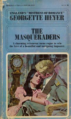
This Heyer I admit I don’t find so charming. If I were in a bookstore looking at the book, I would mostly find it dull and drab — as well as, of course, a bizarre choice of clothing for a novel set during the 18th century. This is a Bantam edition from 1969. The hero has a very modern hairstyle, and — well, looking it over, I think the artist may have actually intended for the picture to be of a 1969 couple. But there were so many very inaccurate covers in the 1960’s — showing that clearly many artists had no concept of how period clothes were made, and the like — that I think it’s often honestly hard to tell if the picture was mean to be period or not!

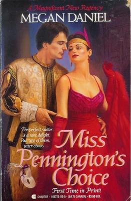
With Megan Daniel’s “Miss Pennington’s Choice” we have the Regency flapper. True, the scene is at a masquerade — but what a clever costume, to see a hundred years into the future! This was published by Berkley through their Charter imprint, in 1988. Though looking more closely, I have decided that she isn’t even a 1920’s flapper — she’s a 1988 woman, complete with 1988 makeup and earrings, in a costume. (No flapper worth her feathers would have had cleavage like that! They all wanted to look like they had the figures of twelve-year-olds.) From a marketing point of view, the cover has its assets — it is bright and lively, and conveys a scene as well as a relationship.

That’s the most recent cover I have posted here — most are from the 1960’s.

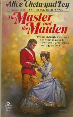
Here’s a 1977 Ballantine edition of Alice Chetwynd Ley’s 1966 “The Master and the Maiden.” Here we have a Victorian lady in 1812! And I’m amazed by the detail the artist went to to portray a vastly inaccurate costume. The gentleman is much less detailed — but equally anachronistic, I think. The scene is somber, with a bizarrely spotty background. It does convey some emotion, but it certainly doesn’t look like a fun book.

Though, to be honest, I suspect it is also a fairly serious novel — I haven’t read it (at least, not recently enough to remember it), but it begins with an author’s note saying it is based on the Luddite Revolts. No, not light-hearted stuff.

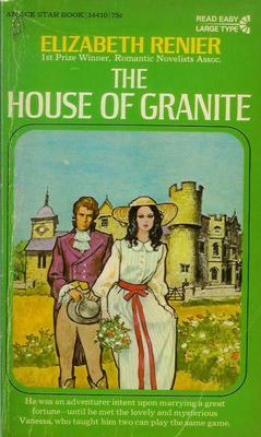
In this 1968 Ace Books edition of Elizabeth Renier’s “The House of Granite” , we have a Regency hero with a 1960’s heroine. Hmm…. The art is simple, and a little weird — bold black lines around everything, lending an almost cartoony look on first glance. On second glance, I see the artist has gotten a surprising amount of detail in. I hate her dress, and the overall look is too Gothicky for me (I was never into books with heroines in nightgowns running away, and this has a bit of that feel), but for its era, it’s not actually that bad. (Which isn’t saying much, is it?)

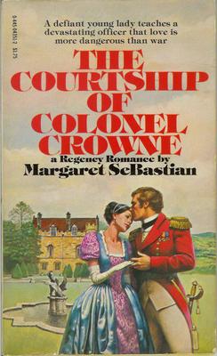
The SeBastian cover is my favorite, in the same way that Wickham was Mr. Bennet’s favorite son-in-law. Yes, believe it or not, this book is set squarely during the Regency. But not only is the heroine in 18th Century dress, with a faux medieval hairstyle (!), the colors of her dress are hideous. This atrocity was committed by Popular Library in 1978. And even from just a marketing standpoint, I think it’s a terrible cover. It looks childish, and the heroine looks terribly passive. But I notice that the heroines on the Ley and the Heyer covers look quite passive too — I suspect it was the style of the period….

Cara
Cara King, MY LADY GAMESTER, Signet Regency 11/05
www.caraking.com

Posted in Reading, Regency | Tagged | 12 Replies


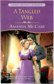
A few days ago, I got a packet of cover flats for my next book, A TANGLED WEB. I like it all right–the purple color is very pretty and rich, the couple not quite as cute-sy as some (though that scene never really happened in the story, and the heroine would NEVER wear purple polyester!). But it made me start thinking about a subject near to every author’s heart–covers. The good, the bad, the ugly.

For better or worse, a cover (something we have zilch control over) can have a huge influence on sales. A vivid, beautiful, interesting cover can grab a reader’s eye and make them pick the book up off the shelf. A bad, ugly, or just plain bland cover can mean that the book, our “baby”, is overlooked, turned away from, even (gasp!) made fun of. (See the hilarious Worst Cover category in AAR’s annual cover contest).

These days there is a vast array of styles out there. There are still old-style clinches. You know the ones–anatomically improbable people falling out of their clothes, bent into poses that would mean a trip to the ER in real life and months in traction. Or my personal cliche favorite, one which seems to pop up often at Avon, the bacon-brained hero who forgot to put his shirt on before running out into the snow after the negligee-clad heroine. But he DID remember his cheesy Wal Mart vampire cape.

There are cartoon covers, some of which are cute and suit the story, some just–weird. There are flowers, castles, pearls, and other inanimate objects. There is hero alone (usually displaying his manly chest), heroine alone, headless people (I actually like these very much), classic paintings. A few I’ve noticed lately:

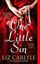
Liz Carlyle’s ONE LITTLE SIN–headless people, great, bright colors, very eye-catching and sexy without being ludicrous. She’s had several great covers. I’m jealous.

Gaelen Foley’s ONE NIGHT OF SIN–personifcation of headless couple-dom. Red background, very sexy.

Barbara Metzger’s ACE OF HEARTS–her previous historicals had that nice headless couple design, misty colors, very pretty, but this one–WTF? Looks like some weird Halloween Western.

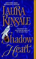
Laura Kinsale’s SHADOWHEART–amazing book, boring cover. This story screams out for a gorgeous Italian Renaissance painting. Maybe a detail of a Botticelli?

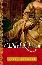
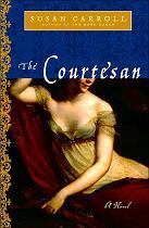
And speaking of paintings, there are Susan Carroll’s THE DARK QUEEN and THE COURTESAN. Again, amazingly terrific books. They look good, too, trade size, 1/4 bright foil, 3/4 a detail of a beautiful painting. BUT–the stories take place in the 16th century. DARK QUEEN features a fluffy Boucher painting; COURTESAN a portrait of Empress Josephine. Very distracting.

Meredith Bond’s LOVE OF MY LIFE–one of those gorgeous Zebra covers that didn’t get a chance. Headless heroine in a vivid turquoise gown, Taj Mahal in the background. Great.

So, what covers do you like/dislike? What would make you pick up a book–or run away screaming in horror? What are some all-time favorites?

Follow
Get every new post delivered to your inbox
Join millions of other followers
Powered By WPFruits.com