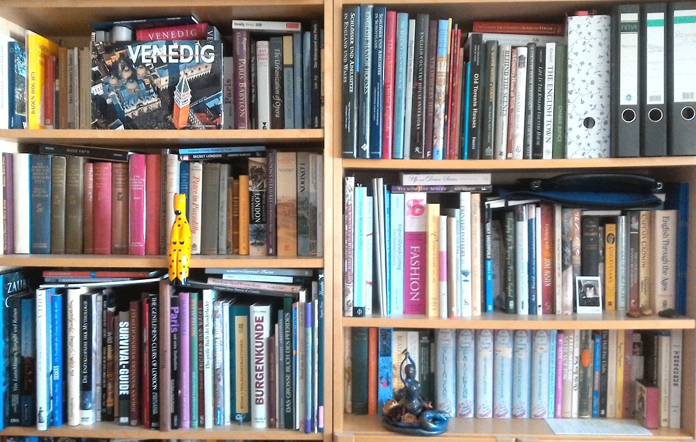
 Like everybody who writes historical fiction of any kind (I imagine), I have collected a surprising number of research books over the years. Some are exactly the kind of books you would expect to find on my shelves – like the books on English country houses and those on the history of London; others are a bit more… shall we say “eclectic”? There’s a book on medieval warhorses (bought in 2001 when I was in Galway as an exchange student), a very comprehensive book on elements of castle building (bought in 1998 when I was still writing fantasy fiction), a book on secret orders throughout history, a catalogue of the Museo La Specola in Florence (a museum of historical anatomical waxes) (why, Sandy, why?!!?!?), and more than one survival guide.
I started collecting research books for my writing in my late teens, so some of those books I’ve had for over twenty years. (And one book has… um… wandered from my parents’ shelves to my own.) I have always loved knowing that I can probably find a book on whatever I want to look up on my shelves. Of course, with the internet, the game has changed completely. Still, I like to have the books on my shelves — just in case.
Now, when you write the kind of historical fiction where your main characters happily shed their clothes on a regular basis throughout the story, it’s always helpful to know how many layers they have to get out of and how these clothes work. For some reason, though, I had never dwelt much on the exact workings of male clothes, except for the obvious, like, if it’s Regency, you want him to pull off his shirt over his head.
That kind of changed when I started to write m/m.
So after doing some intense research on woolen jumpers, there I was in the middle of getting my two Regency guys out of their clothes, when suddenly it occurred to me, “Oh my gosh, what about braces!?!?!?”
What followed were several minutes of me staring intently at the aforementioned bookshelves, scanning my fashion books — only to realize that while I own a good number of books dedicated to female fashion (like Cunnington’s English Women’s Clothing in the Nineteenth Century or Bradfield’s Costume in Detail 1730-1930), I don’t own anything that is solely dedicated to male fashion.
Oh dear. (= A very British way to imply a crisis of epic proportions.)
But luckily, Johnstone’s Nineteenth-Century Fashion in Detail (bought in 2008 in the V&A) came to my rescue. Though for the most part covering female fashion, it still has a few entries on male clothes. Hooray!
As the title implies, the book focuses on details of fashion and includes close-up photos of specific parts of clothes (even though you always get a sketch of the whole piece as well). Moreover, the notes give information about the construction of the depicted pieces of clothing in question, which is really helpful for understanding how these clothes were worn and how beautifully made they were. (I might have said “Ooooohhh!!!!” a couple of times in response to photographs of gorgeous ruffles down the sleeve of a dress or of the intricate embroidery covering the hem of a dress.)
And then I stumbled across these pantaloons.
 Aren’t they GORGEOUS? (And yes, braces. Look at the two top buttons on each side.)
Pantaloons, the accompanying text informs us, “were a form of close-fitting trousers or tights introduced into fashionable dress during the 1790s. They complemented the close-fitting lines of early nineteenth-century men’s coats as they were shaped to the leg, often ending just above the ankle where button fastenings or straps kept them in place. Although difficult to cut and put together without causing creases or wrinkles when the leg was moved, they could look extremely elegant. […] Pantaloons also brought the glamour of military uniform into men’s fashionable dress, especially when teamed with Hessian boots.” The decorated front, however, is unusual, which makes the author conclude that this particular pair might have been for military use.
Still, by that point, I had thoroughly fallen in love with that embroidered front (and all the possibilities it offered for some… eh… playfulness), so I decided they would be exactly the kind of thing my grumpy earl would wear if he wanted to impress somebody special. 🙂
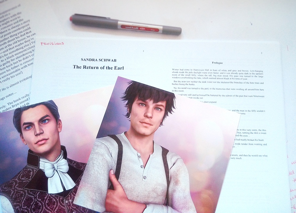
And speaking of the grumpy earl: I got the revision suggestions back from my editor (who loved the story — wheeee!!!), so this morning, my desk features a new, crisp printout of the manuscript, all ready for me to get started on those revisions. Wish me luck!

 When you look at surviving copies of 19th-century periodicals (typically bound in volumes) today, you will perhaps notice a distinct lack of advertisements. Ads were printed on the wrapper (the cover) of single issues as well as on additional pages, and when periodicals were privately bound into volumes, the wrappers and the pages with ads were typically thrown away. Some magazines, like PUNCH, released annual or bi-annual volumes of their publication as special keepsakes – and these didn’t contain any ads either.
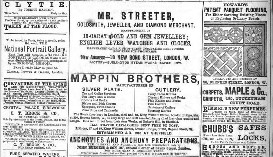 There wasn’t any particular order to them, so Howard’s Parquet Flooring stood side by side with anchovy preparations, the latest novels (such as TAKEN AT THE FLOOD by Mary Elizabeth Braddon), or Thomson’s Unbreakable Corset Busk.
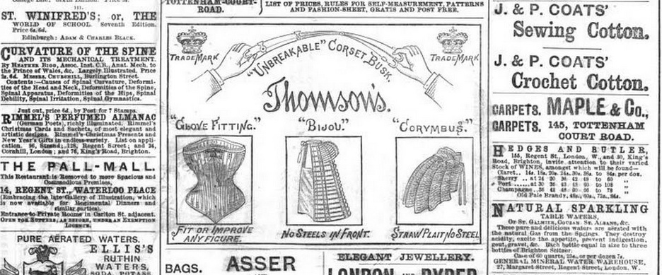 In the early decades of the 19th century, by contrasts, ads tended to be text only, and they were very short and to the point. The reason for this was the tax on paper and the tax on ads. The latter was a reaction to social unrest: the government believed that there was a connection between ads and politics. On the other hand, most periodicals couldn’t survive without the income from ads. Indeed, it is thought that the majority of radical publications folded due to a lack of advertisers.


